Project Overview
Total Sport Graphics is a trusted name in custom sportswear, embroidery, and cresting, serving the community for over 20 years. While their reputation was strong, their brand identity had not evolved alongside their business. The existing logo and branding were outdated, originally created with basic tools, and lacked the professionalism expected in today's competitive market.
The challenge was to give the brand a modern and professional identity that would reflect its high-quality services while maintaining the trust and recognition built over two decades.
The Challenge
The original logo was cluttered and difficult to read, with heavy stylized text and unnecessary outlines.
The business cards were inconsistent in typography, layout, and branding, making the brand appear unpolished.
The colour palette felt outdated, with a lighter shade of red and blue that lacked vibrancy and impact.
The overall identity didn’t reflect the company's growth or industry presence.
The Solution
I took a strategic approach to modernizing the Total Sport Graphics brand while preserving key elements that customers recognized.
Refined Logo Design
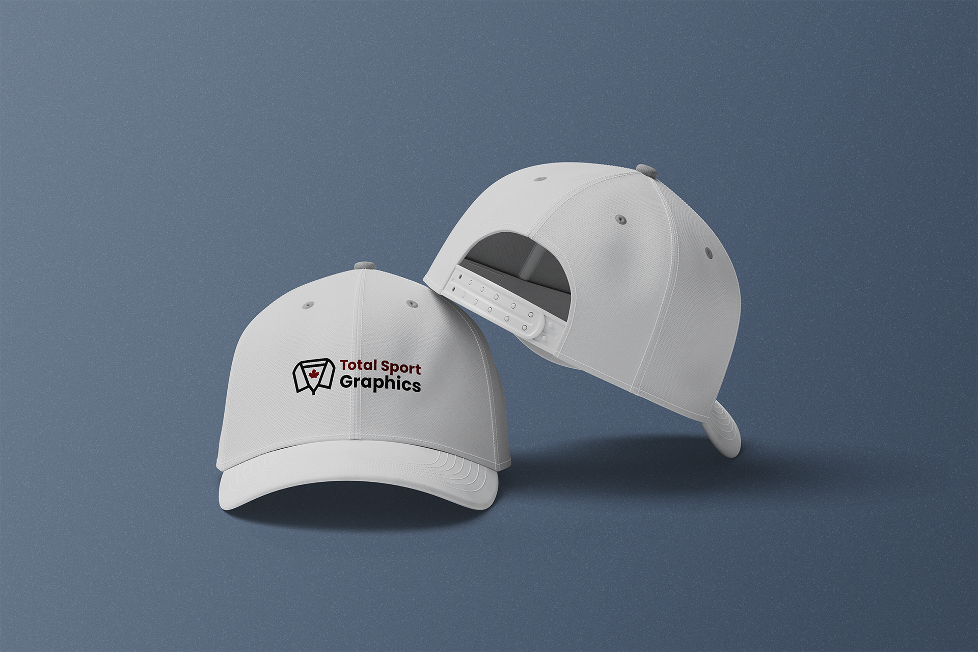
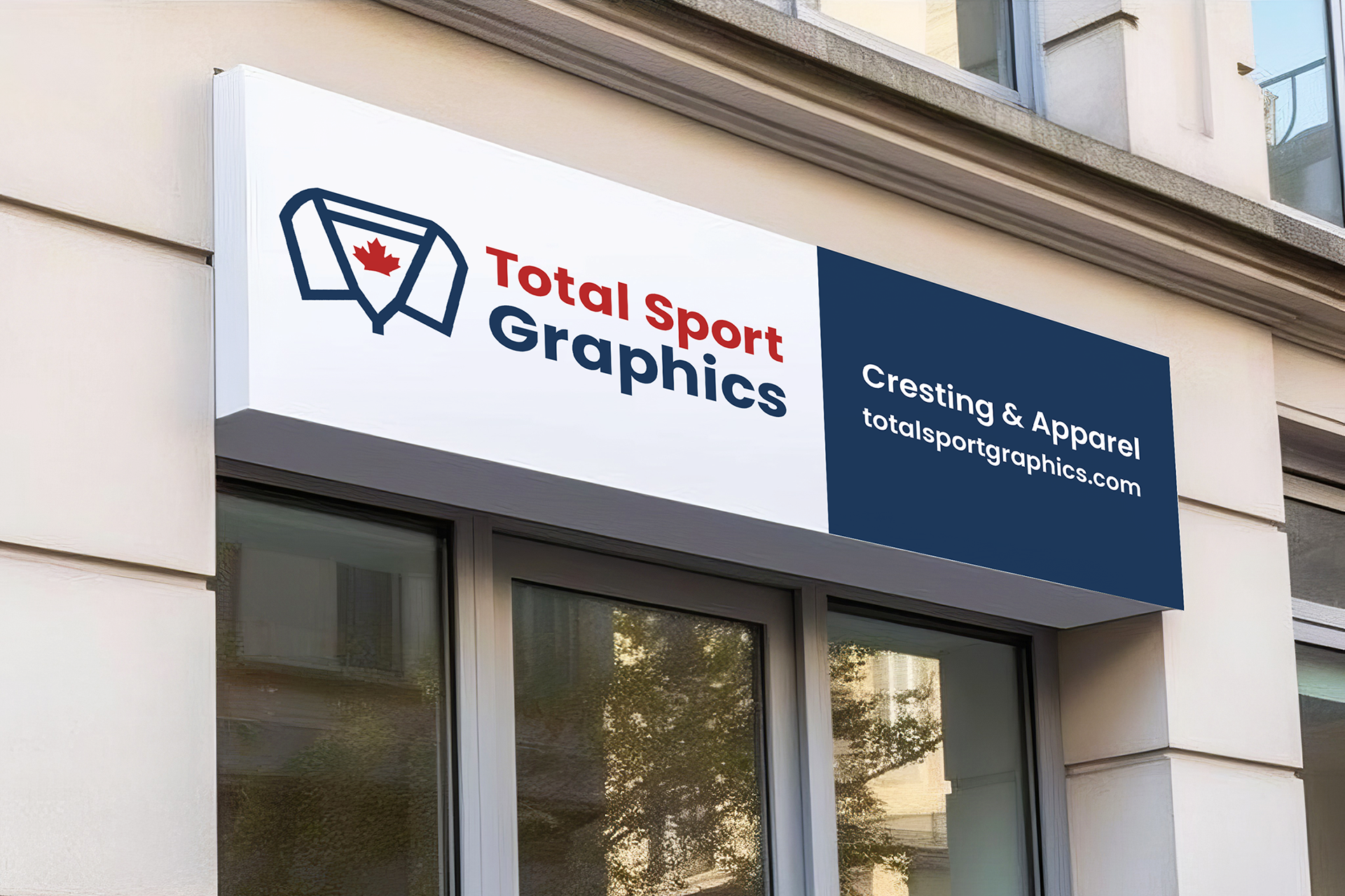
The new logo features a clean, bold typeface for legibility and professionalism. I introduced a modern icon: a stylized sports jersey incorporating a Canadian maple leaf, reinforcing both their industry and national identity. The new logo simplifies the previous design while making it more adaptable across digital and print formats.
Updated Color Palette & Typography
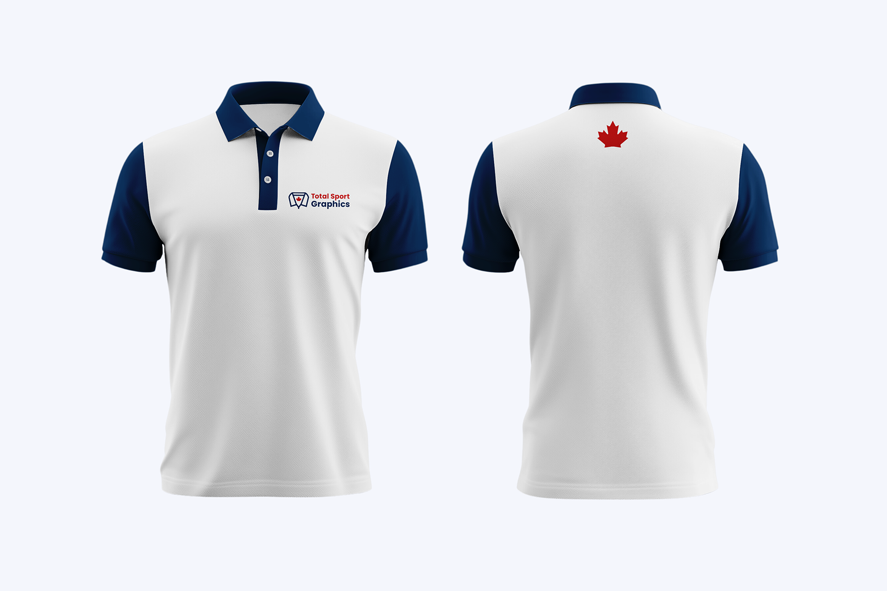
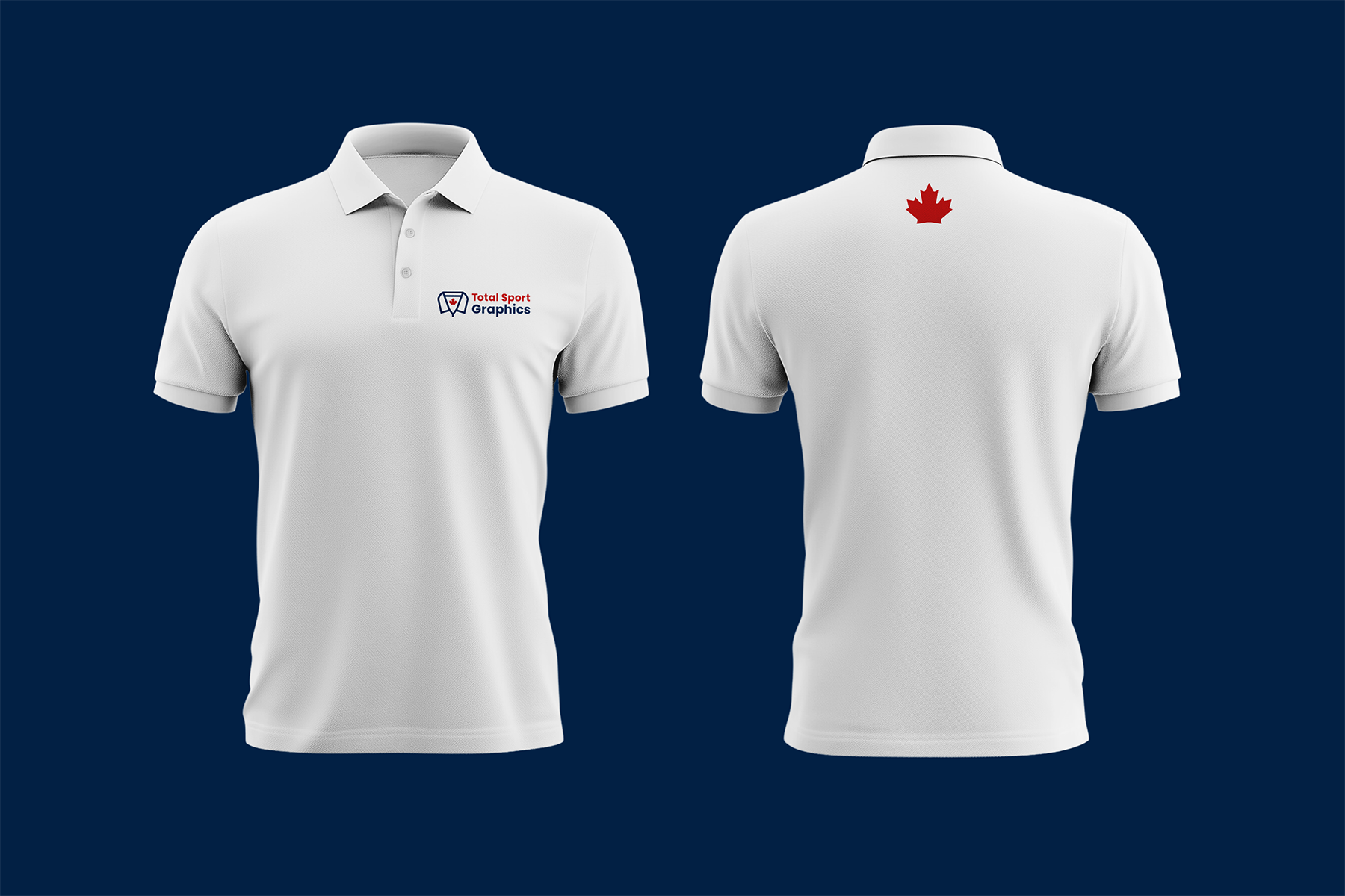
The original lighter red and blue felt dated and lacked the boldness needed for a strong brand presence. I maintained the core red and blue colours for brand recognition but deepened them to richer, more modern tones that feel stronger and more sophisticated. A modern sans-serif font was chosen to improve clarity and scalability across all applications.
Cohesive Brand Identity
New business cards were designed with a sleek, professional layout, aligning with the refreshed brand identity. The redesign ensures consistent branding across all materials, reinforcing Total Sport Graphics as a professional and reliable brand.
Final Outcome
The new branding successfully transforms Total Sport Graphics from an outdated, inconsistent identity into a modern, polished, and professional brand that aligns with its high-quality services. By keeping the original red and blue but deepening them, the brand retains its legacy while stepping into a more contemporary and impactful identity. The redesign keeps the essence of the original brand while making it future-proof, ensuring it stands out in the competitive sportswear industry.


